vol. 02 · tier 01 // ch. 04 of 10 · beginner course
Charts & Candlesticks
A chart is a story told by buyers and sellers. Learn to read it before any indicator.
- read
- ~7 min
- length
- 1,600 words
- position
- 04 of 10
4. Charts & Candlesticks
A chart is a story told by buyers and sellers. Learn to read it before any indicator.
Chart types
- Line chart — closing prices joined. Good for big-picture trends.
- Bar (OHLC) chart — vertical bar with ticks for open/close.
- Candlestick — same data as bar, but visually intuitive. The standard.
- Heikin-Ashi — smoothed candles, easier trend reading, but lags real price.
- Renko / Point & Figure — price-based (ignores time). Niche.
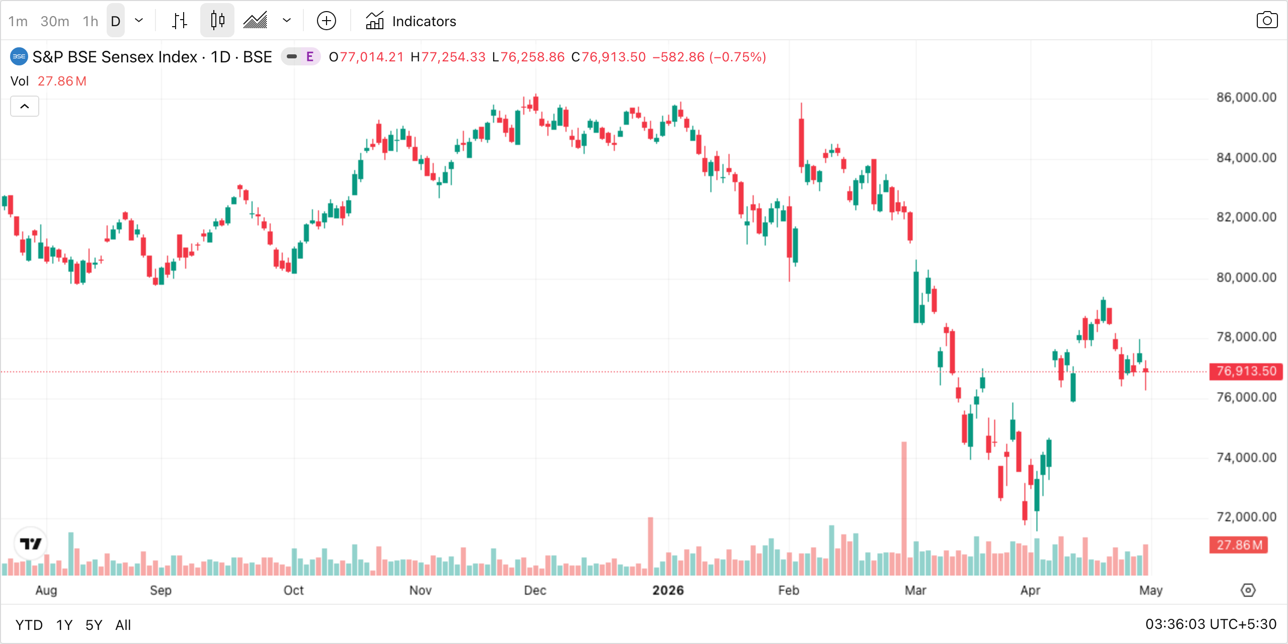
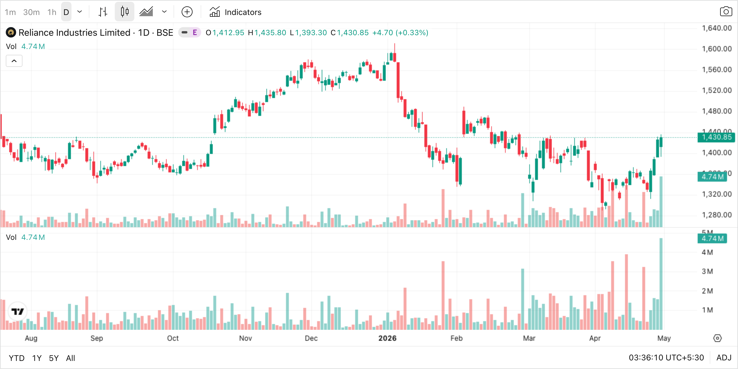
The chart above is the BSE Sensex on the daily timeframe — each vertical shape (a candle) packs a full day of trading into one symbol. Notice how the eye instantly picks out runs of green (up days), runs of red (down days), and shifts of regime: the market grinded up through the second half of the year, peaked, sold off sharply, and is now trying to find a base. Compare that to staring at a column of numbers: this is why candlesticks won. Spend a few seconds tracing the rally, the peak, and the subsequent sell-off — you’ve already done your first piece of chart reading.
Anatomy of a candlestick
Each candle represents OHLC for a chosen timeframe (1m, 5m, 1h, 1D, etc.).
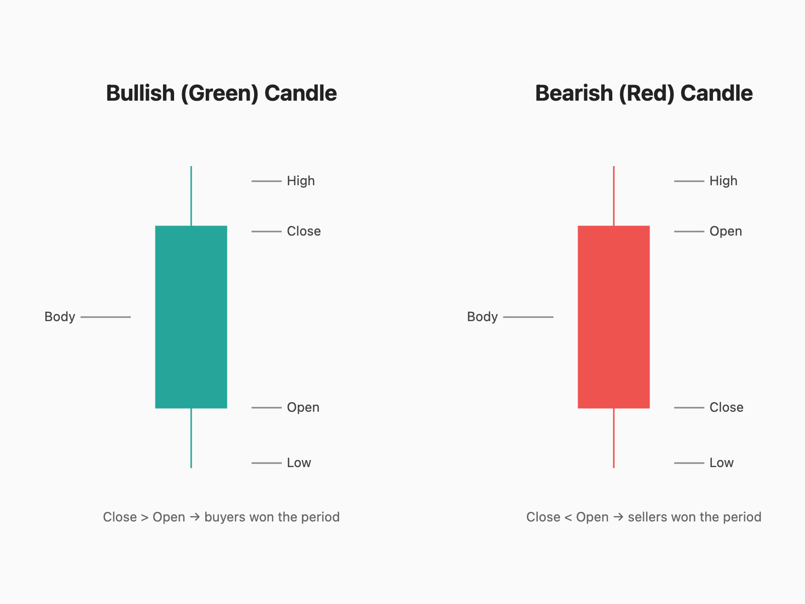
The diagram shows the two candle types side by side. On the green (bullish) candle, the body’s bottom edge is the open and the top edge is the close — because price finished higher than where it started, the body is filled with green. The thin lines sticking out above and below are the wicks (also called shadows); their tips mark the high and low of the period. The red (bearish) candle is the mirror: top of body = open, bottom = close, and red because price closed lower than it opened.
Memorize this: green = close > open, red = close < open. Everything else — patterns, signals, indicators — builds on top of this single truth.
- Body length = magnitude of the move during the period.
- Wicks = rejection — price went there but couldn’t hold.
- Long lower wick = sellers tried, buyers won (bullish hint).
- Long upper wick = buyers tried, sellers won (bearish hint).
Timeframes — pick one and respect it
| Timeframe | Style | Holding period |
|---|---|---|
| 1m – 5m | Scalping | Seconds to minutes |
| 15m – 1h | Intraday | Hours, same day |
| 1D | Swing trading | Days to weeks |
| 1W – 1M | Positional / Investing | Months to years |
Multi-timeframe analysis (MTFA): Use a higher TF for trend, a lower TF for entry. Classic combo: Daily for trend, 1h for entry, 15m for stop placement.
Support & Resistance
- Support — a price level where buyers consistently step in. Acts like a floor.
- Resistance — a price level where sellers consistently step in. Acts like a ceiling.
- When broken, roles flip (old resistance → new support, and vice versa).
How to draw them: connect at least 2–3 swing highs/lows. The more touches, the stronger the level.
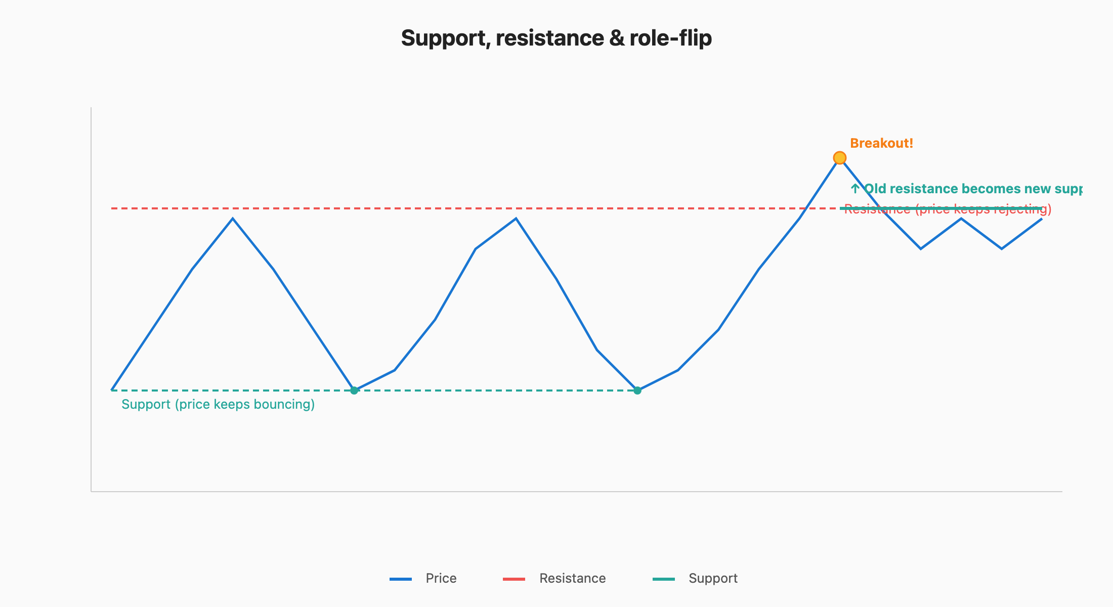
Walk through the diagram from left to right. The green dashed line is support — price falls toward it three times (the dots) and bounces each time, like a ball off the floor. The red dashed line is resistance — price rallies into it repeatedly and gets rejected. For most of the chart, price is just oscillating between these two walls.
Then comes the breakout (yellow dot): a candle finally pushes through resistance with conviction. Now watch what happens next — the very same level that used to push price down (red dashes) starts catching it on pullbacks (now drawn as a solid green line). The role flipped: old resistance has become new support. This is one of the most reliable phenomena in technical analysis, and it’s the basis of nearly every breakout trading strategy.
Trend
“The trend is your friend, until the bend at the end.”
- Uptrend — series of higher highs (HH) and higher lows (HL).
- Downtrend — series of lower highs (LH) and lower lows (LL).
- Sideways / Range — no clear direction.
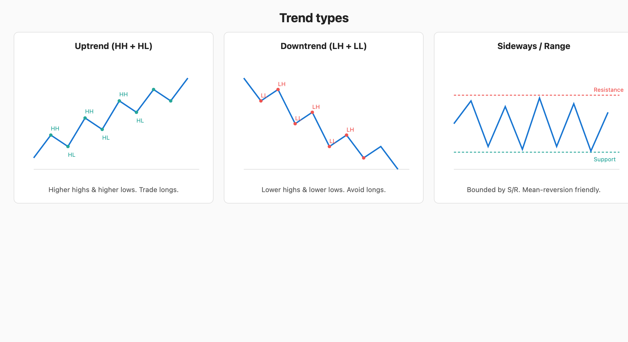
The three panels above show the only three states a market can be in. In the uptrend (left), every peak is higher than the previous peak (HH = higher high) and every dip is shallower than the previous dip (HL = higher low) — the green dots make a clean staircase up. The downtrend (middle) is the exact opposite: each rally fails earlier (LH = lower high) and each drop goes further (LL = lower low). The sideways/range (right) shows price ping-ponging between a flat resistance and a flat support — no staircase, no direction.
Before any trade, ask: which of these three pictures is the chart showing me right now? That single question filters out half of bad trades. Trend-following systems work in panels 1 and 2; mean-reversion works in panel 3; nothing works well during the moments when the chart transitions from one state to another.
Don’t fight the trend. Trade with it; counter-trend trades have lower win rates.
Volume — the truth serum of price
Volume = number of shares traded in a period. Shown as bars below the chart.
Look at the Reliance chart above. The candles in the upper panel tell you what price did; the bar histogram at the bottom tells you how many people agreed. Tall green bars below up-candles mean lots of buying conviction; tall red bars below down-candles mean lots of selling conviction. Short bars mean nobody much cared.
A few specific things to spot: hunt for any candle whose move (size of body) looks impressive but whose volume bar is tiny — that’s a suspect move likely to fail. Conversely, any breakout from a quiet range into a tall volume bar is a real move worth respecting. Volume is what separates a price move with institutional backing from a price move that’s just one or two big retail orders.
- Rising price + rising volume = healthy uptrend.
- Rising price + falling volume = weakening, likely reversal.
- Breakout with high volume = real. Without volume = fakeout.
- Capitulation volume at lows often marks bottoms.
Key candlestick patterns (the only ones worth memorizing first)
Single-candle
- Doji — open ≈ close. Indecision. Strong signal at trend extremes.
- Hammer — small body, long lower wick. Bullish reversal at support.
- Shooting Star — small body, long upper wick. Bearish reversal at resistance.
- Marubozu — full body, no wicks. Strong continuation.
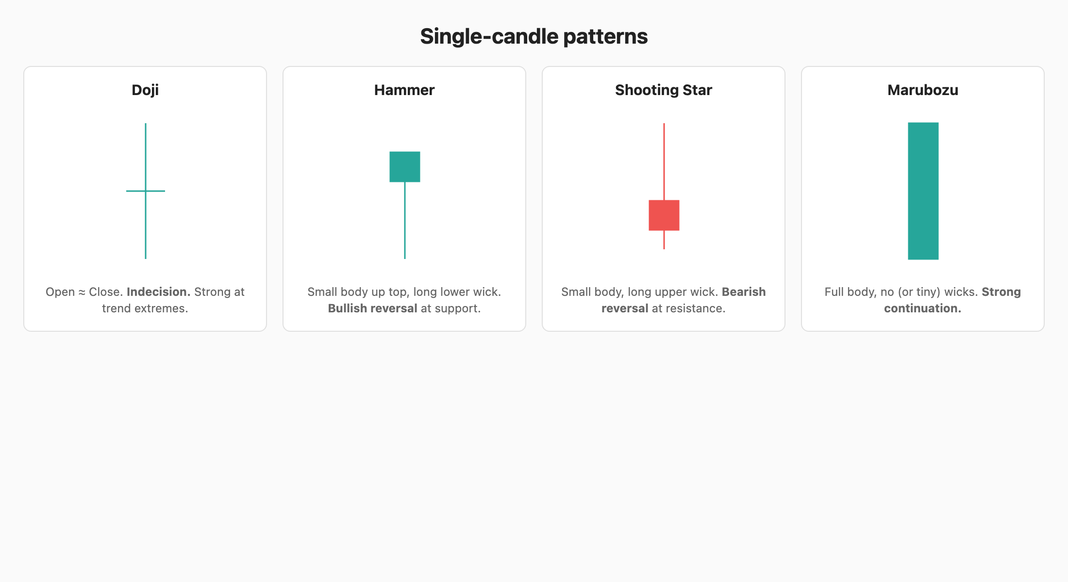
Look at each of the four candles in the panel and notice what the wicks are telling you:
- The Doji has barely any body — buyers and sellers fought all session and ended in a tie. After a long trend, a doji is the market saying “I’m tired.”
- The Hammer has a tiny body up top and a long wick stabbing downward. Sellers pushed price way down, then buyers reclaimed almost all of it before the close. Bullish reversal candidate.
- The Shooting Star is the upside-down hammer: buyers ran price up, sellers slammed it back. Bearish reversal candidate.
- The Marubozu is pure body, no wicks — one side dominated from open to close. Strong continuation signal.
The pattern is in the shape, not the color. A green hammer and a red hammer mean roughly the same thing.
Two-candle
- Bullish Engulfing — green candle fully covers prior red candle. Strong reversal up.
- Bearish Engulfing — opposite.
Three-candle
- Morning Star — down candle → small indecision → up candle. Bullish reversal.
- Evening Star — opposite.
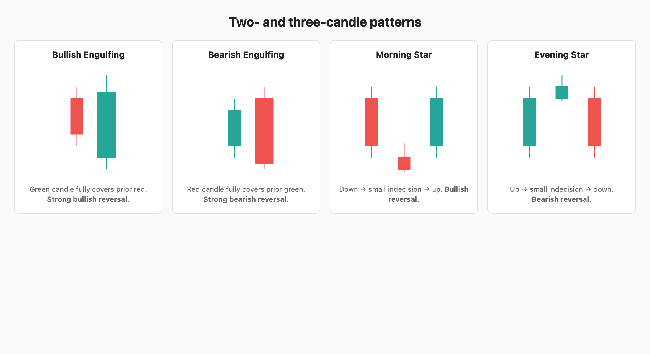
In the top row, notice how the engulfing candle’s body completely swallows the prior candle’s body — in a single bar, the new side has overwhelmed all of yesterday’s effort. That’s why it’s a strong reversal signal: a regime change happened in one session.
In the bottom row, the stars are three-act stories. Morning Star: act 1 is a strong down day (sellers in control), act 2 is a tiny candle (sellers losing energy, buyers and sellers balanced — the indecision is the turning point), act 3 is a strong up day (buyers take over). The Evening Star tells the same story upside-down at a top. Three-candle patterns are slower to form but generally more reliable than single-candle ones.
⚠️ Patterns work in context (at S/R, in a trend). A hammer in the middle of nowhere is just a candle.
Chart patterns (price formations)
- Double top / bottom — M / W shape. Reversal.
- Head & Shoulders — 3 peaks, middle highest. Reversal.
- Triangles (ascending, descending, symmetrical) — consolidation, breaks in trend direction.
- Flags & Pennants — short consolidation after a sharp move; continuation.
- Cup & Handle — bullish continuation, classic breakout setup.
Gaps
- Gap up / down — opening price away from previous close. Caused by overnight news/events.
- Breakaway gap — start of a new trend.
- Exhaustion gap — end of a trend.
- Common gap — fills back quickly, no significance.