vol. 02 · tier 01 // ch. 05 of 10 · beginner course
Technical Indicators
Indicators are math applied to price/volume to surface what's hard to see by eye. They are tools, not crystal balls. Two rules:
- read
- ~14 min
- length
- 3,338 words
- position
- 05 of 10
5. Technical Indicators
Indicators are math applied to price/volume to surface what’s hard to see by eye. They are tools, not crystal balls. Two rules:
- Indicators lag. They confirm; they don’t predict.
- Don’t stack 10 of them. Pick 2–3 from different families (trend + momentum + volatility) — more is noise.
The 4 families
| Family | Question it answers | Examples |
|---|---|---|
| Trend | Which direction? | SMA, EMA, MACD, Supertrend, ADX |
| Momentum | How strong? Overbought/oversold? | RSI, Stochastic, ROC, CCI |
| Volatility | How much movement? | Bollinger Bands, ATR, Keltner |
| Volume | Is the move real? | OBV, VWAP, Volume Profile, MFI |
Trend indicators
SMA — Simple Moving Average
Average of last N closing prices.
- Common: 20 SMA (short), 50 SMA (medium), 200 SMA (long-term institutional level).
- Price > 200 SMA → long-term bullish. < → bearish.
- Golden Cross (50 crosses above 200) = bullish signal.
- Death Cross (50 crosses below 200) = bearish signal.
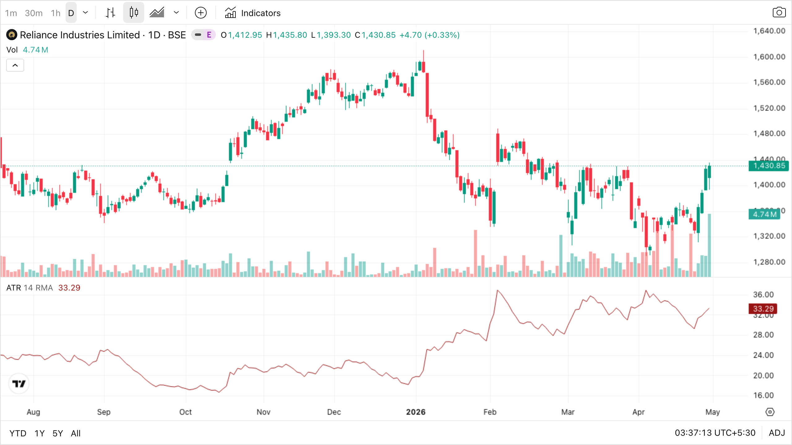
Works when the market is in a clear, sustained trend — the line acts as dynamic support/resistance and as a regime filter.
Fails when price is choppy or sideways — the line gets crossed back and forth daily, every signal is a fakeout, and crossover systems get sliced apart. SMA always lags by half its period, so at sharp turning points it's the slowest to react.
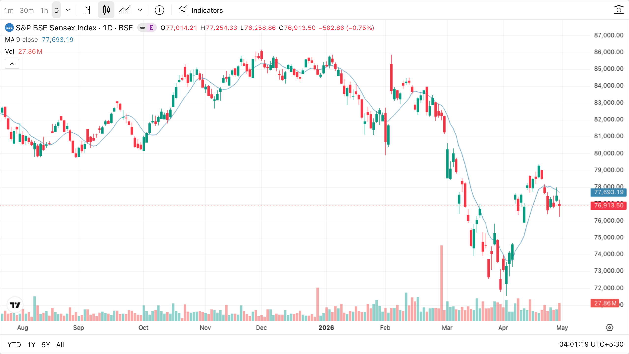
The smooth blue line drifting through the candles is a 9-period SMA on the BSE Sensex daily chart — it averages the last 9 closing prices. Notice how it lags the actual bars; by definition it can’t react to a single day. A short 9-SMA hugs price tightly. Now picture two slower companions in your head: a 50 SMA would draw a much smoother curve through the middle of the candles, and a 200 SMA would be smoother still, almost a straight glide path. The longer the period, the slower the line and the more “institutional” the signal it gives.
Two things you can read off this chart even with just one MA: (1) when the candles are mostly above the line and the line is rising, you’re in a friendly long environment; (2) when price punches through it from above and the line flattens, the regime is in question.
EMA — Exponential Moving Average
Like SMA but weights recent prices more. Reacts faster.
- Day traders prefer 9 EMA / 21 EMA crossovers.
- Use EMA when you need responsiveness, SMA when you want smoothness.
Works when trends are intact but you need the line to react quickly — intraday and short-swing setups, especially the 9/21 EMA pullback. Faster reaction = earlier entries near pivots.
Fails when range-bound stocks with frequent reversals — EMA's responsiveness becomes a liability, firing crossover after crossover with no follow-through. Also unreliable on illiquid small-caps where one big print can yank the line around.
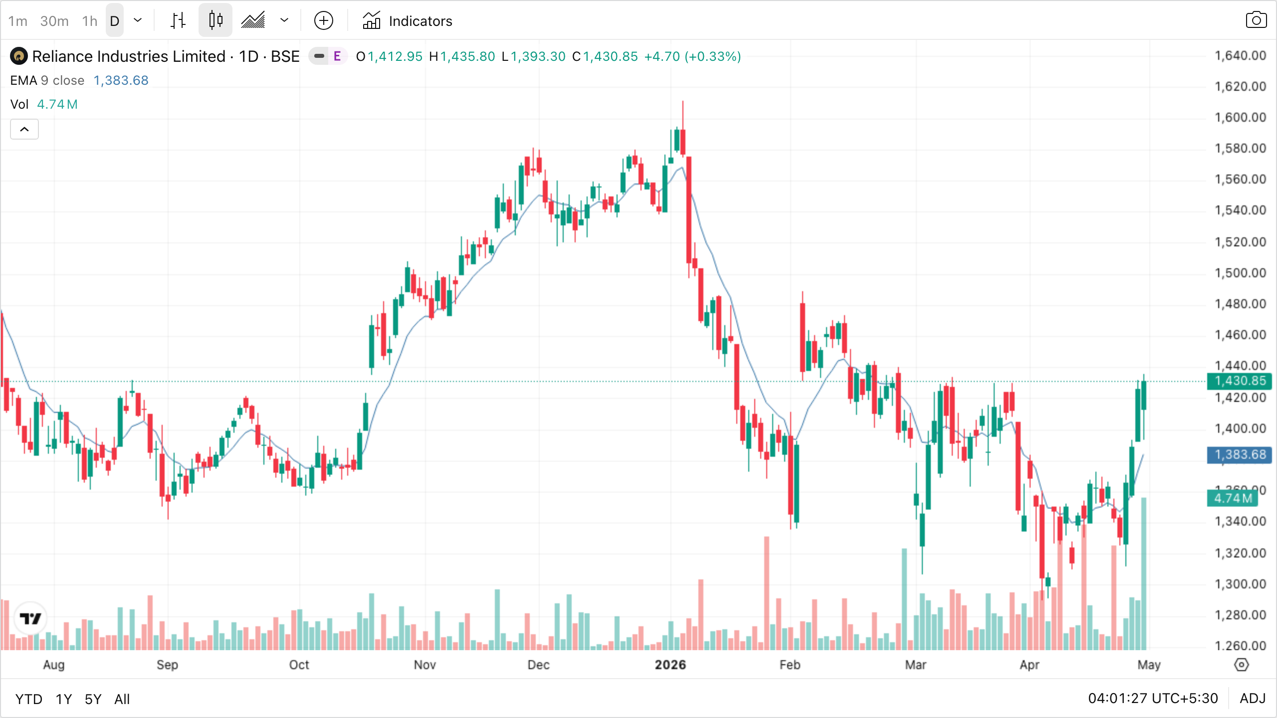
The Reliance daily chart above shows a 9-period EMA — same idea as the SMA but recent bars get more weight in the average, so the line reacts a touch faster (compare its responsiveness during the sharp February drop to how a slower SMA would lag). For day-trading templates you’d add a second 21 EMA on top and watch their crossovers as triggers; on a daily chart like this, the 9 EMA alone serves as a short-term trend filter — above it = bias long, below it = bias short.
MACD — Moving Average Convergence Divergence
Three components:
- MACD line = 12 EMA − 26 EMA
- Signal line = 9 EMA of MACD line
- Histogram = MACD − Signal
Signals:
- MACD crosses above signal → bullish.
- MACD crosses below signal → bearish.
- Divergence (price makes new high, MACD doesn’t) → trend weakening.
Works when medium-term trends and momentum shifts on daily/weekly charts. Divergence calls between price and MACD have flagged many real reversals before the candle confirmed.
Fails when the market is flat (both lines hug zero — every crossover is meaningless noise) or on fast V-shaped reversals where MACD lags hopelessly because it's an average of an average. Don't act on signals when both lines are sitting on the centre line.
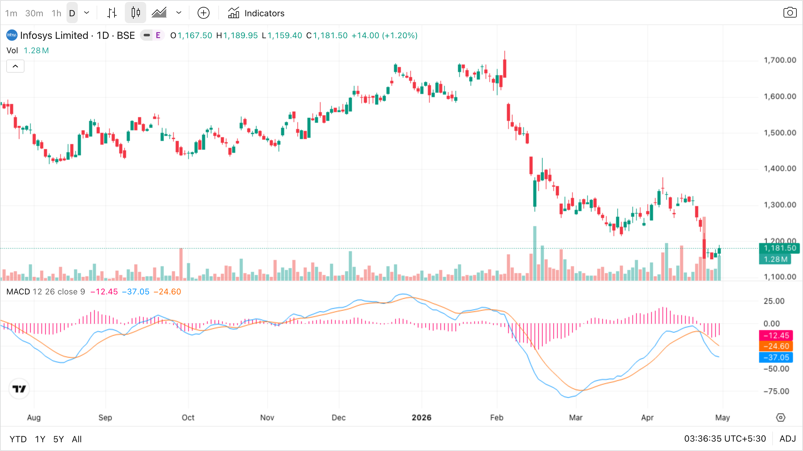
The lower panel of the chart is MACD. On most charting platforms (TradingView’s defaults shown above):
- Blue line = MACD line (12 EMA − 26 EMA) — the faster line, reacts to price first.
- Orange line = Signal line (9 EMA of the MACD line) — the slower, smoothed line.
- Pink histogram bars = MACD − Signal — positive (above zero) when MACD is above signal, negative below.
Colours can be customised, but the faster-reacting line is always the MACD; the smoother one is always the signal. If you ever forget which is which, look at which line moves first when price turns — that’s the MACD.
Three things to look for:
- Crossovers: every time the blue MACD line crosses up through the orange signal line, the histogram flips green and grows above zero — that’s the bullish trigger. Cross down = histogram flips red below zero = bearish.
- Distance from zero: the further both lines are from the centre line, the stronger the trend. Hugging zero = no trend, ignore signals.
- Divergence (the most valuable use): if price makes a new high but the MACD does not make a corresponding new high, momentum is fading even though price still looks healthy. Reversal warning.
Supertrend
A line that flips from below price (green, bullish) to above price (red, bearish). Built from ATR.
- Default: period 10, multiplier 3.
- Excellent for trailing stop-loss and trend confirmation.
- Choppy markets = whipsaws (false signals).
Works when smooth one-way trends — Supertrend hugs price as a near-perfect trailing stop and the flip points line up with the actual regime change.
Fails when sideways or news-driven choppy markets — flips green/red/green/red within days, each flip costs you a stop-out plus a re-entry. Always pair with a trend filter (ADX > 20 or price above 200 SMA).
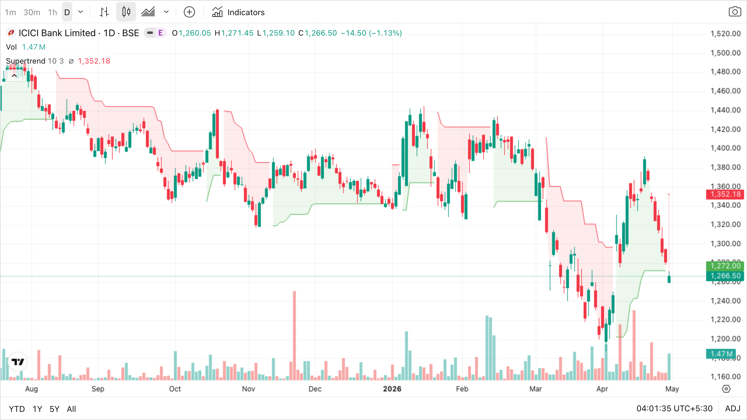
Supertrend is the easiest indicator to use because there’s nothing to interpret — the line is either green and below price (you’re allowed to be long) or red and above price (you’re not). Watch the chart for the points where the line flips sides: those are the regime changes. In smooth trends Supertrend looks like a brilliant trailing stop. The catch shows up in choppy sideways stretches, where it flips green-red-green-red within a week and chops your account to pieces — always pair it with a trend filter (ADX > 20, or price above 200 SMA) so you only act on its flips when there’s an actual trend to trail.
ADX — Average Directional Index (0–100)
Measures trend strength, not direction.
- ADX < 20 → weak trend / range. Avoid trend-following systems.
- ADX > 25 → trending. Trend strategies work.
- ADX > 40 → strong trend.
Comes with +DI and −DI lines for direction.
Works when used as a filter on top of other tools — it answers "is there even a trend right now?" so you only fire trend strategies when the answer is yes (>25). Excellent for switching between trend-following and mean-reversion modes.
Fails when used as a signal on its own — ADX is rising means the trend is already strong, so by the time it confirms you've missed the early entry. It also stays low right before big breakouts, lulling you into thinking nothing's happening.
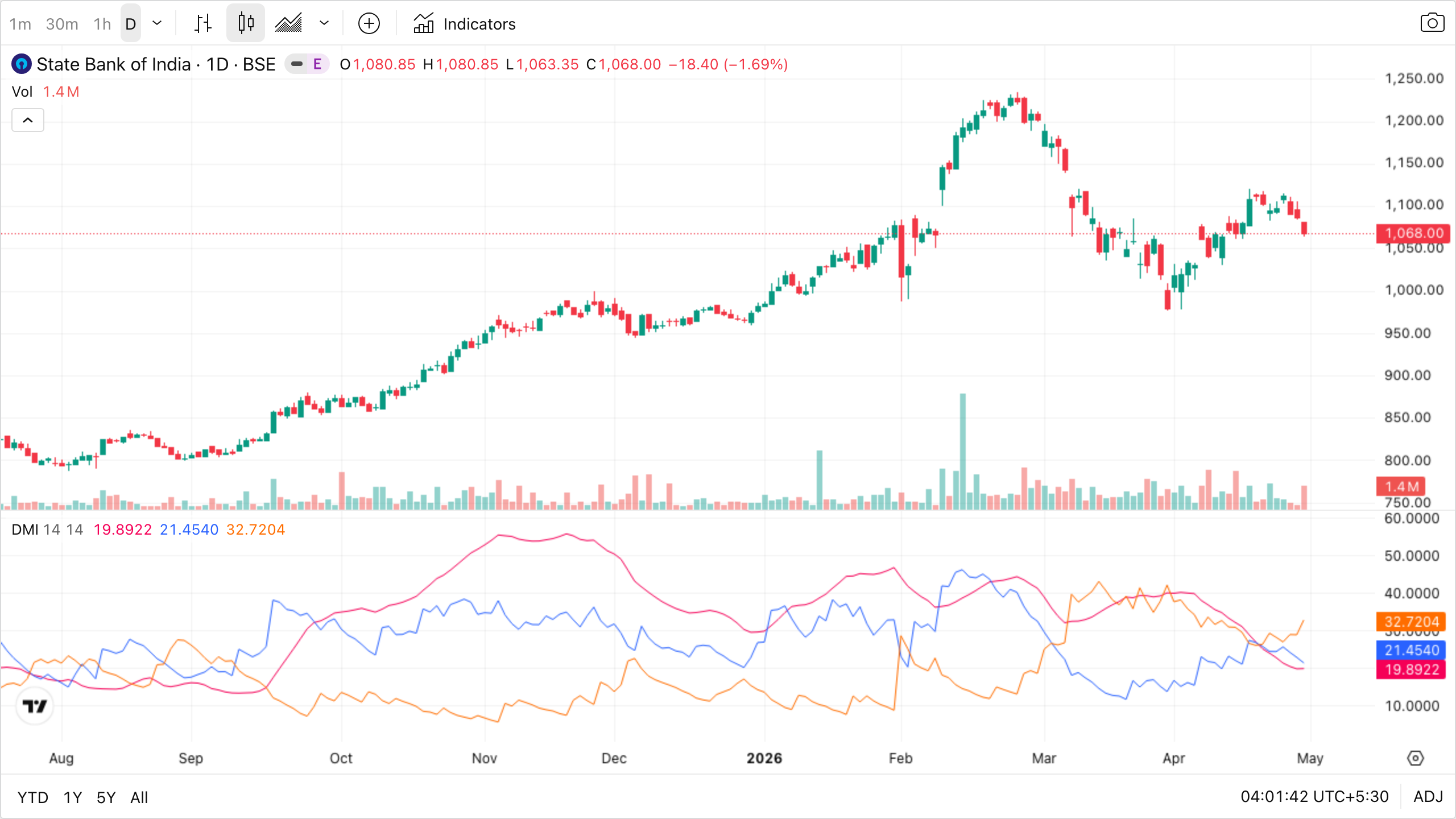
The lower panel is DMI — the standard package that bundles ADX with its two directional companions. Three lines to track: the pink ADX line is trend strength only (no direction), and the blue +DI vs orange −DI lines tell you which side has the upper hand. Use them in two steps:
- First check the ADX line. Below 20 → the market is range-bound, none of your trend systems will work, switch to mean-reversion or stay flat. Above 25 → a real trend is in progress, your trend systems are armed. In this chart, ADX peaks above 50 during the strong Aug–Nov rally — a textbook trending environment.
- Then check which DI is on top. +DI above −DI → trend is up. −DI above +DI → trend is down. Watch the crossover in late September where +DI overtakes −DI — that’s the start of the bullish leg.
ADX is the only indicator that answers “is there any trend at all?” — which is the question every other trend-following tool silently assumes you’ve already answered.
Momentum indicators
RSI — Relative Strength Index (0–100)
- Default period: 14.
- > 70 = overbought (potential pullback).
- < 30 = oversold (potential bounce).
- In strong trends, RSI stays overbought/oversold for long periods — don’t blindly fade it.
- Bullish divergence: price ↓, RSI ↑ → reversal hint.
- Bearish divergence: price ↑, RSI ↓ → reversal hint.
Works when range-bound stocks oscillating between support and resistance — the 30/70 rebounds are tradeable. Best of all, divergence between price and RSI on swing-highs/lows is one of the most reliable warning signs of momentum exhaustion.
Fails when strong trends — RSI can sit above 70 (or below 30) for weeks. Shorting every 70-cross during a bull run is a known account-killer. Use it with a trend filter, not against one.
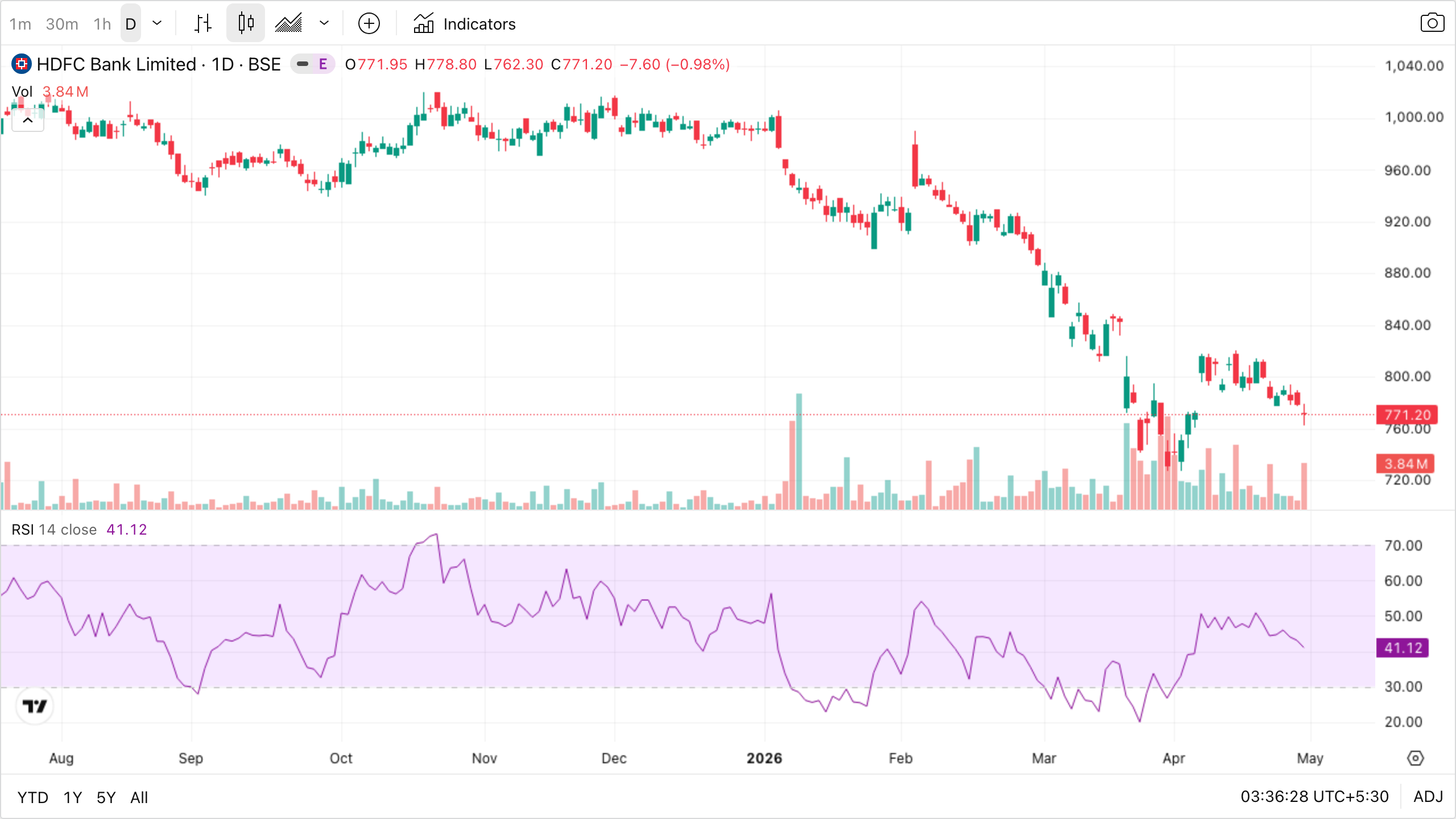
The lower panel shows RSI bouncing inside a 0–100 band, with two horizontal lines marking the classic 30 and 70 levels. Find the spots where it crossed up through 30 (often a short-term low in price right above) and where it crossed down through 70 (often a short-term peak). That’s the simple version of how to use it.
Now find the spots where RSI sat above 70 for a long stretch — if you’d shorted every time it crossed 70, you’d have been steamrolled by a trend. In trending stocks, overbought stays overbought. That’s why RSI is a secondary tool, not a primary one. The most powerful use is divergence: when price prints a new high but RSI prints a lower high than its previous one, momentum is leaking out of the move. Same logic at lows for bullish divergence.
Stochastic Oscillator (0–100)
Compares close to its high-low range over N periods. %K (fast) and %D (slow) lines.
-
80 overbought, < 20 oversold.
- Crossovers between %K and %D = signals.
Works when range-bound or low-volatility stocks — Stochastic fires more often than RSI and the %K/%D crossovers in extreme zones often catch short-term turning points cleanly.
Fails when trending markets — same trap as RSI but worse, because Stochastic reaches 80/20 much faster. Every cross-down from 80 in a strong uptrend is a fake reversal. Filter with trend direction first.
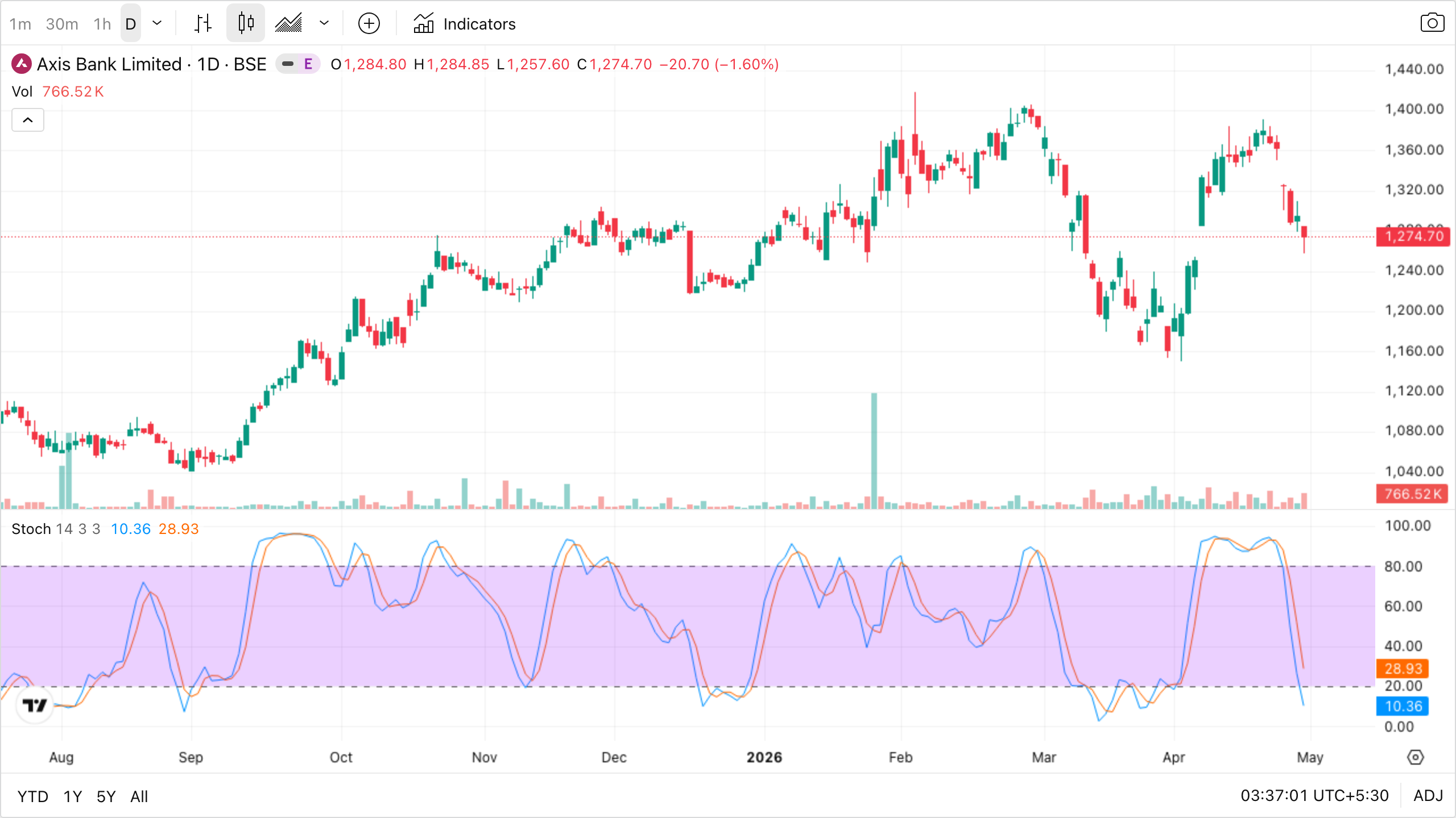
Stochastic looks like RSI’s twitchier cousin in the lower panel — two lines (%K fast, %D slow) zigzagging between 0 and 100, with the same overbought/oversold zones at 80 and 20. The trade signal is the crossover of %K through %D while in an extreme zone: a cross up below 20 = potential bullish turn, a cross down above 80 = potential bearish turn. Stochastic fires more often than RSI, which means more opportunity but also more noise — it shines on range-bound stocks like Axis Bank in this chart.
CCI — Commodity Channel Index
Typically ±100 thresholds. > +100 strong upmove, < −100 strong downmove.
ROC — Rate of Change
% change in price over N periods. Pure momentum.
Volatility indicators
Bollinger Bands
A 20 SMA with bands at ±2 standard deviations.
- Squeeze (bands narrow) → low volatility → big move coming.
- Expansion → trend in progress.
- Touching upper band ≠ “sell” automatically (in uptrends, price walks the band).
Works when spotting volatility regimes — squeezes reliably precede expansion moves, and band-walking confirms a strong trend. Mean-reversion plays back to the middle band work in clearly range-bound stocks.
Fails when treated as a binary buy/sell signal — fading every upper-band touch in a trending stock will get you steamrolled ("price walks the band"). The squeeze tells you a move is coming but not which direction — you still need a trigger.
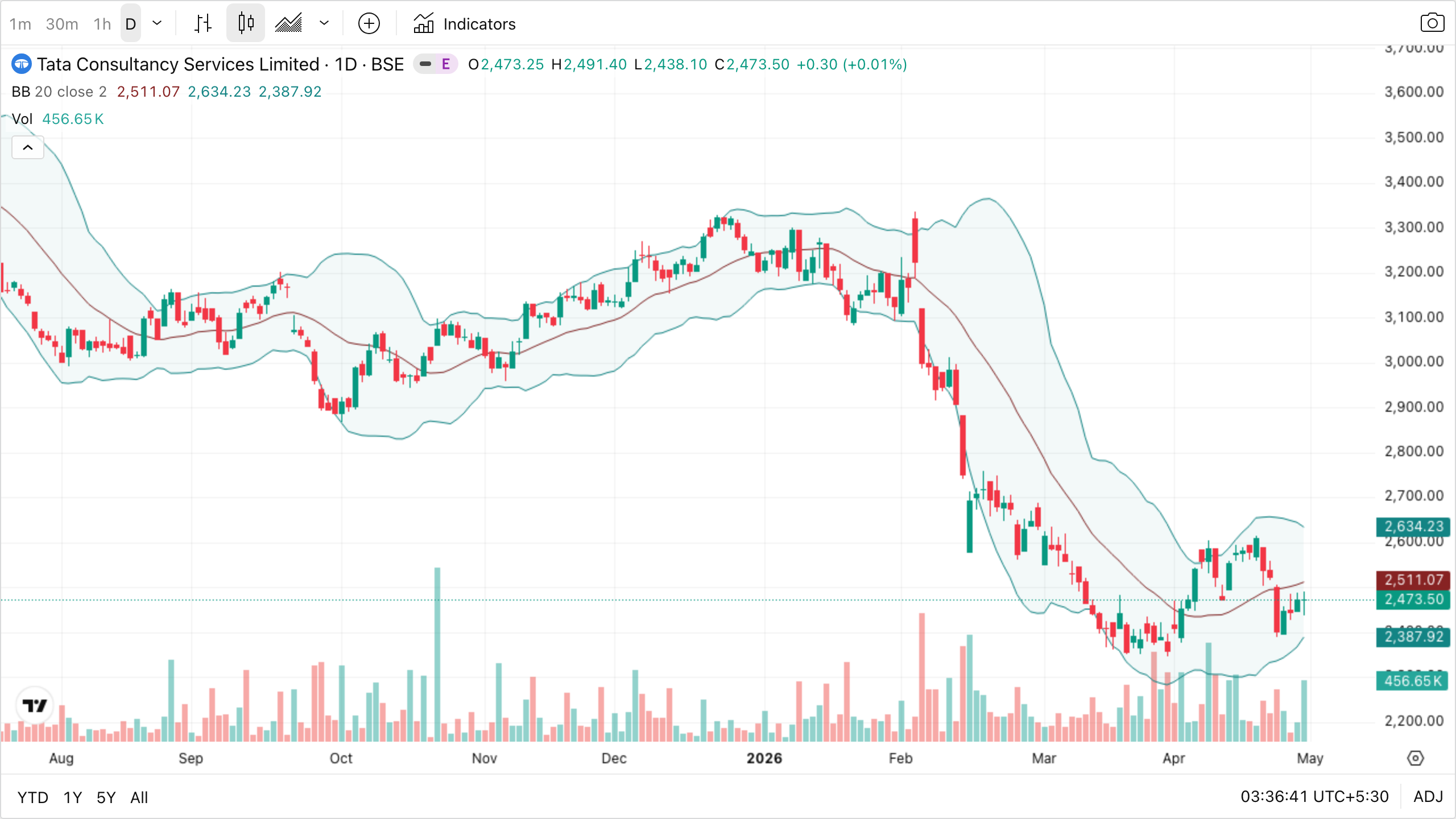
The three lines wrapping around price are: a middle line (20-period SMA), an upper band (middle + 2σ), and a lower band (middle − 2σ). The bands breathe — they tighten when volatility is low and expand when it’s high. Two things to spot in the chart:
- Squeezes — stretches where the bands pinch close together. These are quiet periods where the market is coiling. The next big move usually starts when the bands suddenly expand in one direction.
- Walking the band — in strong trends, price hugs one band for many bars in a row. Beginners see “oh price is at the upper band, time to short!” and get crushed. Touching the upper band is not a sell signal in an uptrend — it’s normal behaviour.
Bollinger Bands answer: “is volatility expanding or contracting?” Combine that with a trend indicator before acting on it.
ATR — Average True Range
Average of the daily true range over N periods (default 14).
- Doesn’t give direction — only how much price typically moves.
- Use case: Set stops at 1.5× to 2× ATR below entry. Adapts to the stock’s natural volatility.
- A ₹3,000 stock with ATR ₹60 vs a ₹100 stock with ATR ₹3 — same % volatility, very different absolute SL distance.
Works when sizing stops and targets in units the stock actually moves in. Adapts automatically to changing volatility regimes.
Fails when used as a directional or signal indicator — it has no opinion on direction. Also misleading immediately after a news spike (ATR jumps, suddenly your "adaptive" stop is wider than the move you're trying to capture).
The lower panel is just one wandering line giving the average daily range in rupees. There’s no overbought/oversold here — ATR doesn’t care about direction. Its only job is to tell you how much room price normally takes to breathe, so you can size your stop-loss in units the stock actually moves in. In the chart, ATR sits roughly between ₹20 and ₹40 — so a ₹5 stop is silly-tight (will get noise-stopped on a normal day), and a ₹200 stop is silly-loose (way more risk than needed). 1.5×–2× ATR is the typical sweet spot. ATR adapts automatically as volatility changes — a stop that worked in calm markets gets wider when news hits, which is exactly what you want.
Keltner Channels
Like Bollinger Bands but using ATR instead of standard deviation. Smoother.
Volume-based indicators
VWAP — Volume-Weighted Average Price
- Resets daily. Used heavily by institutions as their fair-value benchmark.
- Price > VWAP = buyers in control intraday.
- Price < VWAP = sellers in control.
- A common intraday strategy: long pullbacks to VWAP in an uptrend.
Works when liquid stocks during regular intraday trading — VWAP acts as the day's centre of gravity, with institutional algos defending it. Pullback-to-VWAP entries in a trending session are a high-quality intraday template.
Fails when the first 15 minutes (VWAP is still forming on too few prints), illiquid small-caps (one block trade can warp the line), and swing or positional timeframes — VWAP resets every day, so it's meaningless beyond a single session.
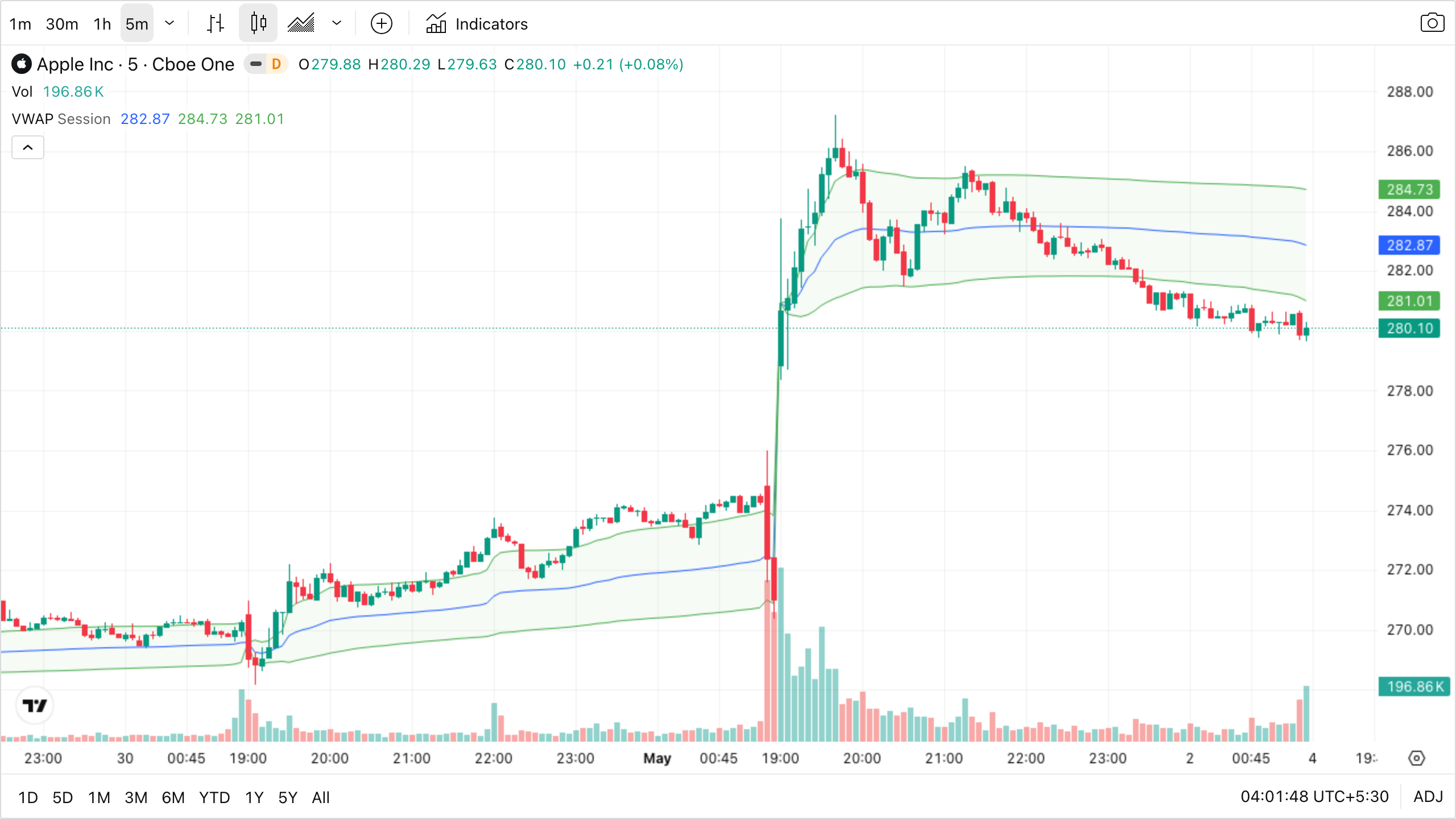
The blue line winding through the bars is VWAP, with light green standard-deviation bands above and below it. Unlike a moving average, VWAP resets every trading day — in this Apple 5-minute chart you can see it begin fresh at each session open (the obvious vertical jump in the middle of the chart is the next session starting). Big institutions use it as their fair-value benchmark: their algo desks try to beat VWAP on buys (fill below it) and exceed VWAP on sells. That’s why VWAP itself acts like dynamic intraday support/resistance. The tradeable pattern: in an upward intraday trend, watch for price to dip back to VWAP and then bounce — that’s institutions stepping in to buy at their benchmark price. The opposite (rejection rallies into VWAP from below) works as intraday short setups in downtrends.
(Apple shown because the public TradingView widget gates BSE/NSE intraday data behind a free login; VWAP behaves identically on Indian intraday charts.)
OBV — On-Balance Volume
Cumulative: add volume on up days, subtract on down days. Confirms whether volume supports the trend.
Works when confirming or warning on multi-week trends — when OBV's slope agrees with price, the trend has real volume behind it. Divergence at swing highs has called many tops.
Fails when intraday or single-day signals — OBV needs many bars to be meaningful. Also susceptible to one-off volume spikes (block deals, index rebalancing) that distort the cumulative line for weeks.
The lower panel is OBV — a single running total that goes up on green volume days and down on red volume days. Its absolute value is meaningless; only the shape matters. Compare the OBV line’s direction to price’s direction: when both rise together, the trend has real participation behind it. When price keeps making new highs but OBV stalls or drops, smart money is quietly distributing into retail enthusiasm — a classic warning of an exhausted move. OBV divergence at extremes has called many tops and bottoms.
MFI — Money Flow Index (volume-weighted RSI)
Same 0–100 scale, accounts for volume. > 80 overbought, < 20 oversold.
Volume Profile
Histogram of volume traded at each price level (not over time). High-volume nodes = strong S/R.
How to actually use indicators (a sane recipe)
Pick one from each family:
| Style | Trend | Momentum | Volatility | Volume |
|---|---|---|---|---|
| Intraday | 9/21 EMA | RSI(14) | ATR | VWAP |
| Swing | 50 EMA + Supertrend | RSI(14) | Bollinger | OBV |
| Positional | 200 SMA | MACD | — | — |
A trade signal = trend + momentum + volume agree. Volatility tells you stop/target distance.
Example — Swing long setup
- Trend: Price > 50 EMA, Supertrend green. ✅
- Momentum: RSI crossed back above 50 from oversold. ✅
- Volume: Today’s volume > 20-day avg volume. ✅
- Entry: Above today’s high.
- Stop: 1.5× ATR below entry (or below recent swing low).
- Target: Next resistance or 2–3× the stop distance.
Indicators are not magic
The same RSI(14) is plotted by every retail trader on the planet. If it worked alone, everyone would be rich. Edge comes from how you combine indicators with structure (S/R, trend) and risk management — not from the indicators themselves.